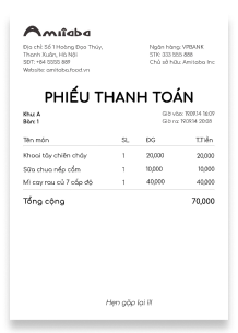
I chose the primary color as a form of a bold red shade because Amitaba is a restaurant, and its menu is mostly fast food and also includes spicy noodles. Therefore, a bold red impresses customers about a fast-food chain with a feeling of delicious and yummy, luscious cuisines. A logo having characters with curves also expresses youthfulness, energy since Amitaba restaurant targets mostly young and teenage customers.


