Project

A responsive website for a donation flow for a charity

Role

Research, Visuals, Interactions

Project duration

Feb. 2022 ~ Mar. 2022

OVERVIEW

The product
Charity Oronto Community is a big charity organization operating globally and helping people in need in many fields.
The problem
The donors want to see detailed statistics on how the organization spends their donation for charity events and specific pieces of evidence of its charity activities.
The goal
Design responsive pages for a donation flow and display the organization's charitable activities and financial statistics.
Responsibilities
Conducting interviews, paper and digital wireframing, low and high-fidelity prototyping, conducting usability studies, accounting for accessibility, and iterating on designs.

UNDERSTANDING THE USER

User research

Summary

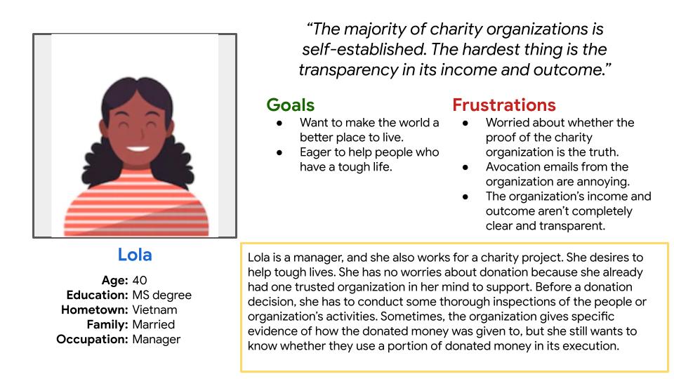
I conducted surveys to understand users’ needs. The research revealed that all donors have questions about how the charity organization spends their donation money for charitable activities.

Most donors want to view the specific evidence of the charitable events, and they also want to know how many percentages of the organization’s donation they spend on the operation.

Method

Online survey

Questions
1.
How often do you donate to a charity? How do you do it? When do you do it? What do you desire for doing so?
2.
Can you describe the steps when you’re donating? What challenges do you face when you donate to a charity? How does it make you feel?
3.
Is there any way you think these challenges could be resolved?
When you donate to a charity, are there any problems that concern you? What do you do to address these concerns?
Pain points

After receiving feedback from user research, I gathered the data, synthesized users' pain points, and came up with the principal goal statements for the donation flow of COC charity. Users need to see the organization's purpose and activities on its page because they want proof to evaluate whether an organization is reliable. Plus, users need to understand how the organization uses its charity budget and executes because they want evidence to decide which organizations deserve to be donated.

Support

Donors doubt how many percentages of the organization’s donation are used in its operation.

Process

Users feel frustrated when receiving lots of gift emails after their donation.

Information

Donors want to see the proofs of the charity activities to evaluate their trustworthiness.

Personas

I also drew personas based on some groups of participants to empathize with users and create user experience stories which form the basis for the design process in the next step. Based on the research, there were some forms of the users' group. The first group of users was people who love online donation because of its convenience, but they doubt the charity's trustworthiness. The second group was people who feel frustrated with the process, such as they might receive extra phone calls or gift emails after their donation.

User journey map
After the personas step, I created user stories, and two user journey maps for Karry and Lola to focus on how specific personas think and feel at every step of the journey. This step benefits a designer by reducing the bias they might have and identifying improvement opportunities.

Starting the design

Sitemap
A sitemap is necessary to ensure design consistency across multiple devices. Incorporating hierarchy and sequential website structures is the best fit for the COC charity website. Based on the data from the user research, users want evidence about the charity activities. So I shaped the hierarchy main pages to include information such as reports, events, and works, whereas a sequential structure is for the donation flow.

Constructing a site map before the wireframing steps helps identify a clear structure throughout the design process.
Paper wireframes
Next, I sketched several versions of paper wireframes for each page. Finally, I refine into one final page by combining the best sections chosen from each wireframe idea.

Because the COC’s users have access to the page via different devices, I drew wireframes for additional phone screen sizes to ensure the website is fully responsive.

Digital wireframes
Moving from paper to digital wireframes made it easy to access user pain points, improve user experience, and create low-fidelity for usage in the usability study period later.

After creating digital wireframes for desktop screen size, I created digital wireframes for phone screen size.
Usability study

To determine the usability of the initial design, I conducted a usability study. I connected all relevant screens in the digital wireframes and made a low-fidelity prototype for the study. I built a research plan that included the project background, research goals, questions that I wanted to seek out, participants, scripts, and KPIs to evaluate the designs. I used the Maze app to conduct my unmoderated usability study. Gathering feedback from 7 participants, I came up with some insights to iterate on my designs in the next phase.

Parameters
Study type: Unmoderated usability study
Location: Anywhere, remote
Participants: 5 participants
Length: 5-10 minutes
Findings
1.
Users were confused with two donate buttons, one on top of the top bar and the other on the donation page.
2.
Users were unsure if they could change their donation later on the payment page with the update button.
Refining the design
Mockups

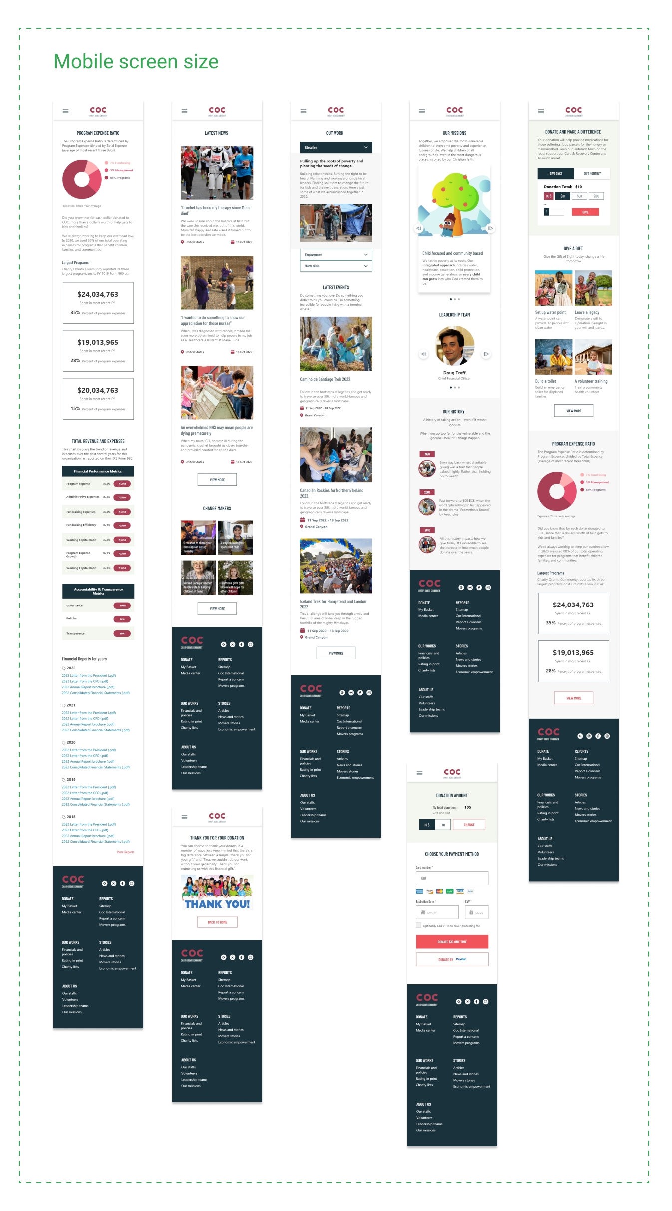
After the first usability study, I dived into drawing mockups, and I iterated insights from highest to lowest priorities on my mockups. I removed the donate button placed on the top bar in my new mockups and replaced it with a regular link like the other ones. Applying the 60-30-10 color principle to designs, I chose a bold red shade as the principal color and used it for call-to-action buttons. Black blue was utilized along with red for highlighting elements. The rest of the color shades were white with text in different black shades.

Prototype

Low fidelity prototype
High fidelity prototype
Takeaways
Impact

The new design built trust between the charity and supporters by stating a clear view of the financial status of the charity and knowing how the donors’ donations were used.

What I learned

The most critical takeaway from the COC project is to always focus on the users’ needs when coming up with design ideas and solutions. I also learned to design a responsive website with good accessibility; you need to walk through essential steps like creating a sitemap and wireframing for multiple screen sizes.